Typeface Pairing: The Case Against It
Most brands do not need two typefaces. They need one typeface used with discipline.
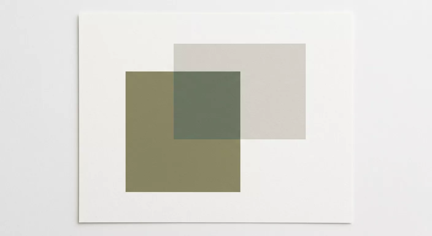
The convention of pairing a serif with a sans-serif has become so automatic that designers rarely question whether the second typeface is doing any work. It is often there for contrast, which is not the same as function. Contrast can be achieved within a single type family through weight, size, case, and spacing. Adding a second typeface to a system introduces a second set of proportions, a second rhythm, a second voice. Unless there is a clear reason for two voices, the result is noise.
What a Single Typeface Requires
Working with one typeface demands a family with sufficient range. The studio favors type families with at least five weights and an italic for each. Söhne by Klim Type Foundry offers Extralight through Bold in both regular and mono widths. This provides enough variation for any brand application, from a whisper-weight wordmark to a bold navigational element, without introducing a second design language.
Hierarchy with a single typeface is established through scale, weight, and spacing. A heading set in Light at 32pt with -20 tracking sits in a different register than body text set in Regular at 15pt with standard tracking. The visual distance between these two settings is sufficient. They do not need to be different typefaces to be different in function.
When Pairing Is Justified
There are legitimate cases. A brand that operates across editorial and commercial contexts may benefit from a serif for long-form reading and a sans-serif for navigational and functional text. Magazine publishing is the clearest example. The serif carries the editorial voice, the sans-serif handles captions, page numbers, and section headers. Each typeface has a defined role, and neither could perform the other's function as well.
The test is simple: can the second typeface be removed without losing a distinct function? If the answer is yes, it should be removed. If the second typeface exists only because someone believed two typefaces look more professional than one, it is decoration, not design.
The Licensing Argument
There is also a practical consideration. Premium typefaces are expensive. A comprehensive license for a single family across desktop, web, and application embedding can run into thousands of euros. Specifying two families doubles the cost and doubles the maintenance burden when licenses expire or type foundries update their EULA terms. For brands with distributed teams, every additional typeface is another point of potential inconsistency.
The studio's default recommendation is one typeface, minimum five weights, with clear documentation for which weight is used in which context. The result is quieter than a dual-typeface system. It is also harder to execute poorly.